Data visualisation
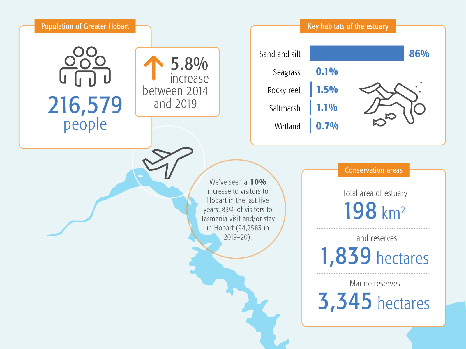
‘A picture paints a thousand words’ and can be a great way to share data, like this information from the State of the Derwent Report 2020 Update.
As a science-based organisation we have a lot of data! There is a lot of in-depth monitoring and analysis work that goes in to ensuring we can fulfil our strategic purpose of working together to “understand the Derwent Estuary, use science to enhance and protect its values and involve the whole community”.
An important question that we have recently asked is: what does the community want to know? And what is the best way to present that information?
The results of the community survey told us that generally people would like access to four types of information:
- Governance – how the Derwent is managed, and what mechanisms are in place to manage the activity that affects it by farms, industry etc
- Water quality – updates and improvements in water quality, and how it impacts recreational activities
- Biodiversity, history and natural environment – species information, natural features and the history of the Derwent
- Participation – how people can be involved, volunteer, stay updated and discover special features and insights.
Based on this valuable feedback, the DEP is now working to develop an online way to share the data that is important to the community.
Thursday 3 April 2025